Mastering Camera RAW
Almost any modern digital camera can shoot in JPG and RAW format. The main difference between these two is that JPG is the result of the data processing obtained by the camera and as a consequence, a squeezed image with a high amount of lost information, and RAW is the complete information that was submitted to the camera matrix during the process of shooting. As a result smart modern cameras cope with the data processing successful enough and provide a quite acceptable result in JPG format, however, with rare exceptions, they can't do this better than we do.

Adobe Camera Raw Basics Tutorial
In this tutorial, we’ll take a tour of the Adobe Camera Raw interface and uncover a host of tips used by the professional photographers, from White Balance Tool, Lens Correction and using the Tone Curve to Lens Vignetting.
Workflow Options - First of all it's better to adjust the Workflow Options. We should choose the color Space we shall be working in (if a photo is going to be printed we choose Adobe RGB 1998, if you are going to use this file excursively for web purposes, sRGB is quite enough), and also select Depth, Size, and Resolution of our future file.

White Balance Tool - Before moving to the next part, I would like to draw your attention to one more moment – White balance tool. This is an eyedropper tool that works similar to the gray point eyedropper in Curves in Photoshop. The tool is extremely useful in some questionable moments with white balance.
Although White Balance Tool is convenient, still the primary tool used to change white balance and some other extremely useful things is located in some other place. To get it we should move to the right, central part of the Basic toolbar.

White Balance – In this drop-down window we can choose several standard automatic white balance settings, which can also be found in any camera. It should be taken into consideration that in spite of the “commonality”, they can differ rather significantly depending on the camera. You can always try the variant Auto, and sometimes it even provides a quite acceptable result. Well, if nothing of the proposed fitted you, then you have manual white balance tools at your disposal - Temperature and Tint. Well, and again, don't forget about an eyedropper White Balance Tool!
Exposure – One of the main tools of the converter. With its help, you can make substantial expo correction of the available shot. For example, in case if a shot is overexposed it can be corrected with the shifting the trigger to the minus. Watch for changes in the preview – the overexposed areas will be filled with red color, which is very convenient and informative.

Recovery – a Recovery tool allows to extend the dynamic range of a photo during the process of elementary converting, removing overexposed areas where required, (almost) not affecting other parts of the shot.
Highlights - is the second tool that helps to extend the dynamic range. With its help you can lighten too dark areas of shadows, (almost) not affecting other parts of the photo. Want to underline the fact that you should use Fill Light and Recovery tools carefully and don't lose a sense of proportion, as if you overdo with them, you will get ugly, flat and noisy photos. If you use them correct and accurate, these tools are priceless!
Clarity - One more excellent tool using that you can increase the tonal contrast of the image or, on the contrary, decrease it and get something that looks like “soft focus” effect. But be careful! If you overdo with it, the image can be spoiled – noises and artifacts will appear, especially noticeable in non-focus areas, or details in the least contrast areas will disappear.

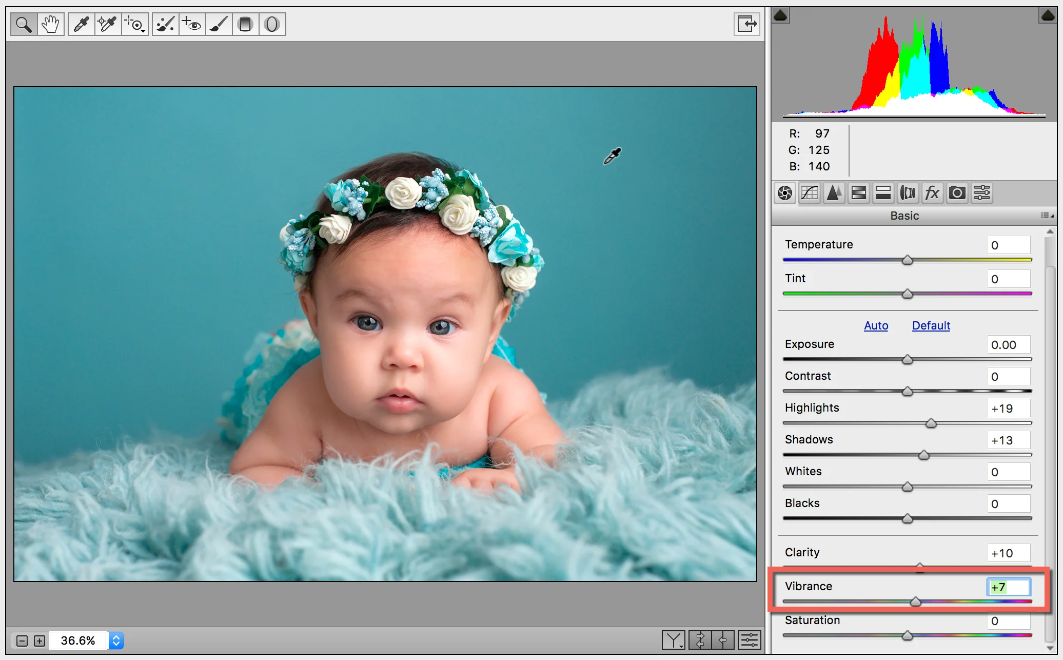
Vibrance - a very helpful, to my mind, tool that entirely replaced Saturation tool for me personally. Its main advantage is that it increases a saturation of color selectively, only in the areas that already are the most prominent and bright, (almost) not affecting calmer (background) tones.
Tone Curve – Everything related to contrast can be refined here, working directly with the histogram and separate areas of light, shadow and midtones. The principle of work is the same as in Curves of the Photoshop, however, also more simplified. If we work with the second tab Point, we get the same graph in which we can work on any random points as in Photoshop. But in the Parametric tab data change is performed by changing the values of four points (light in two values and shadows in two values). For people who don't understand Photoshop Curves very well, Parametric tab should be much more evident and intuitively clear.

Detail – Here we will work with the sharpness of the image and try to eliminate with noises.

Sharpening - with the help of this tool the sharpness of the image can be significantly increased. It operates by the same principle as the most popular tool of this kind in Phototshop - Unsharp Mask. I can tell that personally I use this tool in the converter very moderate, most often in those cases, when previously have been working on noise suppression.
Noise Reduction - consists of two parts - Luminance and Color. In the first you work with the suppression of brightness noise and in the second with color. If there is a necessity, in Color graph cursor can be safely moved almost up to the maximum value, it won't do any harm. However, you should be careful with Luminance- the higher is the value, the lower will be the overall sharpness of the image. Nevertheless, it can be slightly corrected.
HSL / Grayscale - the most important part of color correction in the converter. Here you can rather flexible and fast convert an image into a black and white spectrum, to do this you just need to place a mark next to Convert to Grayscale. Now we are working with color, so leave this part and move to the tabs of HSL tool – an exciting, in my opinion, a rather successful mixture of Hue/Saturation, Selective Color, and Channel Mixer of Photoshop.

Hue - Working with various color channels, here you can choose tones of any of the colors provided.
Saturation – On the same principle as in the previous part, here you can work with a saturation of different colors, not affecting any others.
Luminance – This tool allows to change a saturation of colors by channels from darker to lighter ones and vice versa.
Lens Corrections – correction of the defects of the operation of optics.

Chromatic Aberration – ugly color contours, spots, and stripes, resulting from the fact that lens cannot always correctly combine all three components of light (red, green and blue) in one point on plain recording an image. As a rule, chromatic aberrations appear in the areas of the greatest contrast (for example, along the outline of a dark object on a light background). Precisely these disturbing effect can be eliminated with the help of the Chromatic Aberration tool. Increase an image up to 100% and higher and while moving a cursor watch the changes in problematic areas of the picture, until you achieve the optimal result.

Lens Vignetting - that means darkening of the image on the edges of the shot. This tool allows to eliminate those blackouts or on the opposite to create them. It should be noticed that the problem of vignetting in the work of the modern optics arises more and more seldom, that's why this tool is usually used not to decrease but to increase vignetting value. This artistic technique allows to darken empty or unimportant parts of the image, attract more attention to the center, underline the main object and convey the particular atmosphere of the scene.